Tuesday, 24 July 2018

Tuesday, 26 June 2018
Glueman is strong

Reanimated a moment from a comedy wrestling video, action was too big so had to include camera move.

Monday, 30 April 2018
Rat Plans ft. Self Doubt
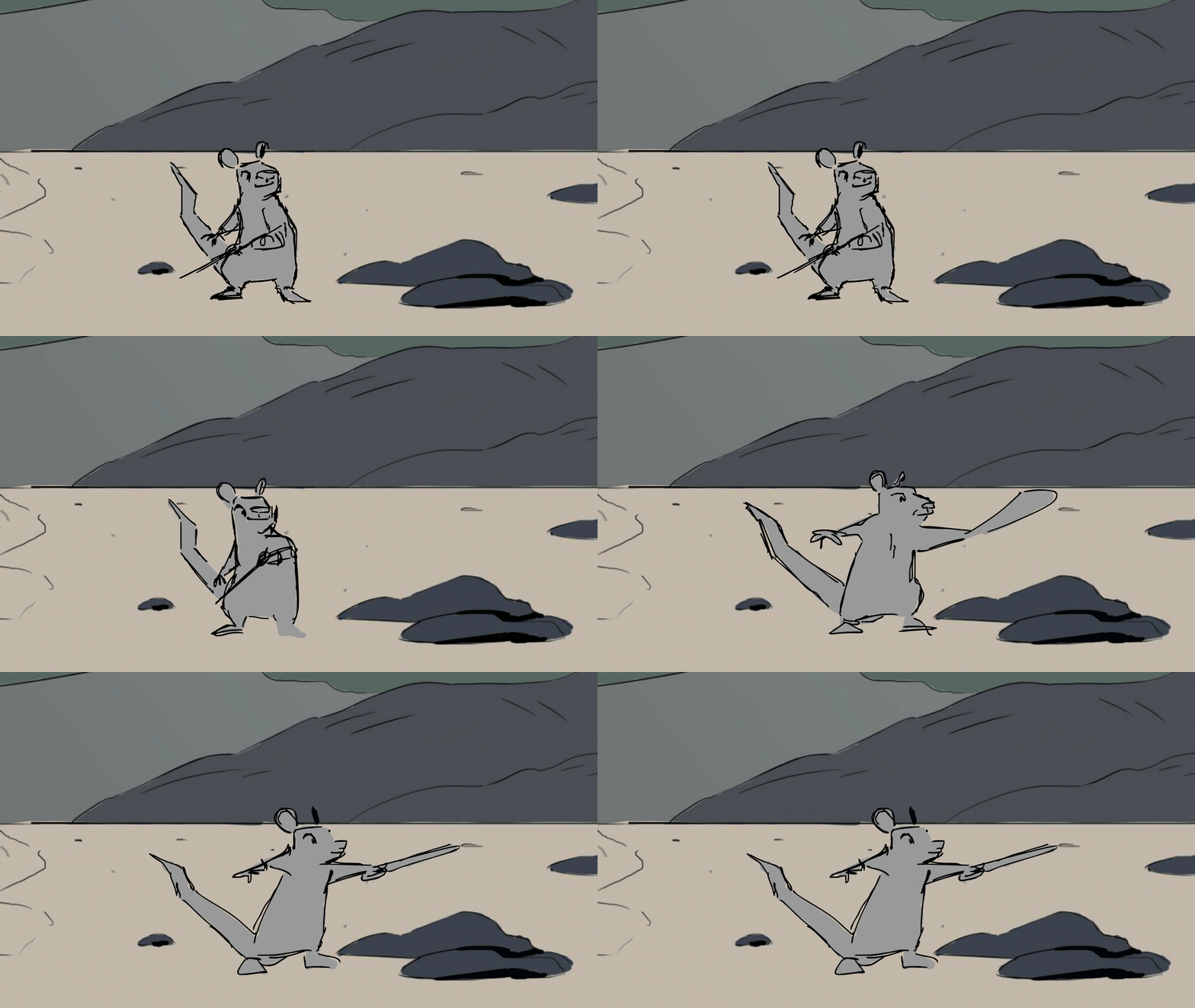
Because of this I have never been able to convince myself any of my stories are worth developing and have this moment of panic where I feel like I'm running out of time before third year and this isn't worth following up on, and so I switch to a different idea. In reality this just wastes more time as I've learnt how much time and effort it takes to develop a story and it doesn't help constantly resetting in the hopes of a stronger starting position.
During the pre-production module last term I began working on a story which I thought would be appealing to the tutors, a piece set historically with an art style grounded in that time and a story that was attempting to comment on an issue that was important to me. But it felt like a chore, I had very little art for it and I wasn't motivated to make anymore, it wasn't something that I wanted to make. Which is why I decided to develop a story based on a sketch I did whilst procrastinating from the first one. The sketch was of a rat dressed like a pirate and I thought it was kind of funny and I like rats.
And now I sit here, weeks after term has ended, and my main character Pokey is still what I find myself drawing every day. Even now I have my doubts about this project, it maybe not being as action orientated as the things I'd like to produce or that it really isn't saying anything deep like all the short films our tutors show us in lectures but I am committed to my rat story. I think working past self doubt is all a part of the writing process and a healthy part of developing a fleshed out story.
So with that in mind I have chosen to spend this summer continuing to develop my story, 'Rat Trap' to make it as visually and narrative engaging as possible. And I hope I never get sick of drawing fat little rats.
Wednesday, 18 April 2018
Evaluation of 'Rat Trap'

And whilst this started as simply a dumb joke I found that there was also drama to be had in that setup, the rats believe themselves valued members of pirate crews where they aren't even noticed. Pokeys arc is about discovering his role in the world because it certainly isn't as a pirate but he is too far into the facade to acting like just a rat.
The narrative begins as a fairly conventional pirate story, he arrives at the island and encounters Scab and they wind up duelling over conflicting ideas and miscommunication really. This scene is most evocative of the previously mentioned adventure movies, I took direct inspiration from 'Captain Blood' for this part in the location for the duel to take place in.

Concept art (left) is by Eloise Gardner
However after this scene the narrative takes a turn away from a pirate story as Pokey kills Scab in the name of the humans only to find that they've left without him. He is left on the island to slowly become more rat like and eventually become like Scab, but he does not want this and the story ends with him crafting a makeshift raft and leaving the island to make a place for himself.
 In retrospect I think the story in its current shape is a little clumsy, after the humans leave the pacing is broken and it is waiting for Pokey to make the decision to leave but as of right now it isn't motivated by an engaging narrative. And the ending itself feels slightly underwhelming, really the story just sort of peters out after the mid point which is frustrating.
But I do think it has some interesting aspects, I think with some more development it'd have quite a strong visual style and I think there is a lot of comedic moments in the setup. I may even decide to develop this and pitch it as my third year film.
Wednesday, 4 April 2018
Rat Trap


This is the main character Pokey, he joined a pirate crew after wanting to escape life as a city rat surrounded by filth. He wanted to see the world but he doesn't realise he's more of a castaway than a pirate, he has deluded himself into thinking he is a valued member of the crew.

This is the antagonist, Scab. He has lived on the
island for a while now. He was once abandoned on the island much like Pokey is now, he seems to have lost his marbles a little from being trapped so long.
Monday, 2 April 2018
Character design - Space Prince

This is a character I imagine comes from a pulpy science fiction melodrama story in the style of those from the 70's. He is an estranged Prince of a royal kingdom who has dissapeared in the wake of his father becoming fatally ill, he is the next in line for the throne other than his brother who is infamously sadistic and is only interested in starting a galactic level war with a rival kingdom.
So naturally the missing Prince is a target for many people, whether that be sympathisers of his brother who wants him permanently gone, royal soldiers, and even people who don't want his brother to be in power.
However he is hiding in a deep corner of the universe, running from his responsibility as a leader since he is not interested in leading. He is quite a selfish character, but his refusal to stand up to his role as leader also goes hand in hand with not wanting to face the fact his father will die. So he runs.
Wednesday, 28 March 2018
Storyboard Project - 'Extraction'

It's inspired by spy thrillers like the Bourne series or the most recent series of Bond movies, as well as videogames I've played like Syphon Filter and Metal Gear Solid. But I also want to incorporate a sense of humour that I think those IPs lack, not explicitly comedic but it doesn't take itself so seriously. When trying to explain this I think of the climatic sequence of Blade which I love for how it finds moments of comedy in a narrative that takes its ridiculous premise so so seriously.

Some basic character design sketches, I want simple designs that are easy to draw to focus on the direction. It also has science fiction elements such as the metal visor in the first image.
I only intend to take this as far as an animatic for my portfolio, I think this takes some of the pressure off and lets me focus on the skills that I am trying to develop.

Thursday, 22 March 2018
Animation evaluation - Bin kick
These are some rough keyframes I provided for a group project this term, they're a little rough but I'd like to take a look to see how I could improve.
I don't think a lot of these drawings are solid enough to be considered keyframes, even at the best of times I've left things like hands with little visual information making it more difficult for the inbetweener to know how it should look. Shifting volumes are still an issue in my animation as a whole, with body parts sometimes changing quite drastically. This becomes even more obvious when it comes to cleanup phase.
Although on a positive note I think this piece of animation has a fairly good sense of weight, I utilized anticipation and follow through to try to make this action appear more violent then kicking over a bin actually may be to better suit the narrative of the piece.
Wednesday, 14 March 2018
Designing for Animation (Is Hard)
Developing visual design for animation has its own very specific challenges unique to the genre, something I have discovered having recently been assigned as art director on our live brief project. My initial set of designs I thought to be most visually appealing were not suitable for animation, they only seemed to work from the few angles I had drew them from and it was difficult to imagine how they might move. My team members also voiced concerns about the amount of unnecessary detail of the characters considering the time limit we had. At the time I found this frustrating because I didn't see any issue with these designs but in retrospect they were not at all suitable and I spent too much time fighting that rather than fixing it.
So I went back to the drawing board and altered the designs to simplify the shapes and remove unnecessary details. But I think it went to far into the opposite direction and we landed on bland characterless designs. Which forced me to change how I was thinking about my design philosophy for project, although at this point it was too little too late and we had to stick with the lack luster designs.
 So with that in mind I'm spending time focusing on designing characters for my third year pitch. I've been looking at the art of Andrew MacLean for inspiration, he is a comic book artist but I think his art would be perfect for animation. As you can see to the left his art style is very graphic, with geometric shapes that are easy to identify, he uses shorthand when the characters are at distant such as faces boiled down to main elements. I think his use of the lines within some characters may be excessive for animation but I've been using his designs as a point of reference when designing my own characters.
 Compare his face in the image below to the own above, he doesn't depict as much detail at a distance because the necessary visual information is still conveyed just with less lines, which is a more economic approach for animation.
So I went back to the drawing board and altered the designs to simplify the shapes and remove unnecessary details. But I think it went to far into the opposite direction and we landed on bland characterless designs. Which forced me to change how I was thinking about my design philosophy for project, although at this point it was too little too late and we had to stick with the lack luster designs.
 So with that in mind I'm spending time focusing on designing characters for my third year pitch. I've been looking at the art of Andrew MacLean for inspiration, he is a comic book artist but I think his art would be perfect for animation. As you can see to the left his art style is very graphic, with geometric shapes that are easy to identify, he uses shorthand when the characters are at distant such as faces boiled down to main elements. I think his use of the lines within some characters may be excessive for animation but I've been using his designs as a point of reference when designing my own characters.Compare his face in the image below to the own above, he doesn't depict as much detail at a distance because the necessary visual information is still conveyed just with less lines, which is a more economic approach for animation.
Sunday, 7 January 2018
Naptime [Short animation]
When I made my self portrait video for school a while ago I decided I enjoyed the medium and wanted to try to push it further. So I made this video to try to see what I could do visually a bit more, I tried to utilize the medium by having a shot of a character floating across the screen made much easier to do by using pixelation. I also used after affects for two shots, a transition early on where a character runs across the foreground the next short is layered underneath coming in behind him, and a shot of the same character in some sort of drug trip looking experience. I want to keep pushing the visual effects in the videos I make because I enjoy doing it, I also want to practice practical effects in live action, like blood squibs or miniatures. I think I did a decent job with the 2d overlay animation in this video, I used it to illustrate magic spells in a slightly crude fashion but I think it animates well and works with the animation style. I think one weakness in this video is the audio editing, this is the part of the process I find most tedious and I think it shows in the quality. If I make another one of these pixelation videos, which I probably will, I want to be more ambitious with the scope of it. Longer, more creative use of pixelation and the overlay animation, etc.
'Junk Boy' - Character Development
 |
| One of the first drawings of the boy character, wasn't sure what his story was at this point so he has a very different personality here. I eventually decided I didn't want the character to be one who is actively violent or has a weapon. But I do like the energy in this drawing. |
 |
| At one point the story had the boy finding some kind of mythical sword. |
 |
| This one is pretty much there in terms of costume and hair, but far too brooding. |
 |
| Early portrait of the boy trying to capture his personality as a troublemaker kid. |
 |
 |
Another earlier drawing trying to figure out his clothes,
I ended up deciding that he wasn't 'raggedy' enough.
|
First digital drawing of the character, done in Flash. I think
I lost some of the energy of the character here and the drawing itself
is quite stiff but I have the costume pretty much down at this point.
These are only a select few of the development drawings of the character that seemed significant in how he changed, and are also mostly finished. I did many more trying to flesh him out and figure out details of style and features. And I still am, none of these are final designs currently.
'Junk Boy' - Film Idea Synopsis

A boy in a post apocalyptic world crashes his ship on his journey home, having neglected it's need for fuel. He ties down his ship and heads off toward the nearest town to find fuel. He finds it empty of people but luckily he finds a robot which he harvests for it's power cell. Unfortunately that was not the only robot, and a much larger gollem-like machine appears, enraged at the boy. The robot chases the boy back to his ship, he loses the power cell in the process. Now hiding in his ship, without fuel and a robot pushing the ship toward the long fall, the boy seems to have lost hope. But then he formulates a plan to tether the ship to the robot just as the ship begins to slide off the cliff, immobilizing the robot and allowing the boy to harvest the power cell of the helpless robot. He then flies away, momentarily bringing the robot with him before dropping him into the deep canyon as he flies away.
Saturday, 6 January 2018
'Junk Boy' Visual Development; 3d/2d Hybrid Style
Whilst brainstorming my story idea I had always assumed that if I made it I'd make it in 2d, being the medium I am most familiar with. However the more I thought about it the more I realized that this story would come with it's challenges if hand drawn. Namely, it involves a lot of mechanics, robots, planes, bikes etc. I find these things difficult to draw, let alone animate. I think it would be difficult to animate these things well, keeping their form and weight, making them appear solid and consistent, they're also quite visually complex just by nature so even as a time saving measure it seemed sensible to think about the possibility of 3d animation.
However the aesthetic of the film was something very important for me and in my idea of what 3d animation looks like I couldn't visualize what I wanted to put on screen. So I started brainstorming some ideas of how to implement 3d whilst achieving the visual tone that I wanted. I actually think in the end I much prefer how the film may hypothetically look using these techniques rather than all hand drawn. Below are some rough sketches of the ideas I took away from my research into 2d/3d hybrid methods.
 This first image shows very simply a cliff in the foreground rendered in 3d, the stage the character would occupy. But the background is a 2d hand drawn painting. This is to maintain the texture I want overall in the film, and I think it'd be an interesting look having the background very clearly drawn. I believe this idea is actually quite common as a time saving practice in 3d
modelling, we were taught it last year in our 3d background module, using a jpeg as a texture on a large plane behind the actual scene to create a backdrop for the setting. I also find it interesting that it is essentially the matte painting technique from live action film being used in a digital setting.
 One bullet point in this image notes 'low poly models with painted textures', again this is partly a time saving method on the modelling end and an aesthetic choice. I think the hand drawn look is very important to me for this film idea, having it looking almost like an ink sketch, with loose pen marks and heavy black lines. And I think having that sort of look in the textures with high poly count could potentially be jarring because with high detail in the model you'd expect the same with texture, even with a stylized model. I think it would work as an aesthetic choice, one really big inspiration for this visual style is the game 'Tiny and Big; Grandpas Leftovers', on the image on the right you can see a lot of what I'm talking about here in practice. This is very close to the aesthetic I am looking for. The geometry is fairly basic but it has a lot of appeal as a design due to the charming hand drawn textures.


This sketch demonstrates one of the more obvious aspects of the style, I'd like to animate the special effects aspects in 2d and the models in 3d. I want to do this because I don't think it makes sense to do things like smoke and fire in 3d because the complications of giving it a hand drawn look becomes pointless when I can just animate these parts in 2d. In general I want quite a lot of additional animation, random particles and dust, the world reacting to what's happening within it. I think this helps sell the world as 'real', create a sense of verisimilitude. Even in excess, I'm quite inspired by the films of Jon Woo and the special effects utilized in his movies, particularly gunfights that make the scene feel very alive and gives it a unique energy. I think this would also help to blend the 2d and 3d elements more seamlessly if it was less obvious what was 3d, 2d or even post production.

However the aesthetic of the film was something very important for me and in my idea of what 3d animation looks like I couldn't visualize what I wanted to put on screen. So I started brainstorming some ideas of how to implement 3d whilst achieving the visual tone that I wanted. I actually think in the end I much prefer how the film may hypothetically look using these techniques rather than all hand drawn. Below are some rough sketches of the ideas I took away from my research into 2d/3d hybrid methods.

modelling, we were taught it last year in our 3d background module, using a jpeg as a texture on a large plane behind the actual scene to create a backdrop for the setting. I also find it interesting that it is essentially the matte painting technique from live action film being used in a digital setting.
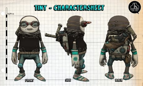 One bullet point in this image notes 'low poly models with painted textures', again this is partly a time saving method on the modelling end and an aesthetic choice. I think the hand drawn look is very important to me for this film idea, having it looking almost like an ink sketch, with loose pen marks and heavy black lines. And I think having that sort of look in the textures with high poly count could potentially be jarring because with high detail in the model you'd expect the same with texture, even with a stylized model. I think it would work as an aesthetic choice, one really big inspiration for this visual style is the game 'Tiny and Big; Grandpas Leftovers', on the image on the right you can see a lot of what I'm talking about here in practice. This is very close to the aesthetic I am looking for. The geometry is fairly basic but it has a lot of appeal as a design due to the charming hand drawn textures.
Another trick I came across was in a recent trailer for the new Spiderman movie, which contains endless visually inspiration but this method stuck out in particular for what I was looking for. It appears that frames have been cut from the animation to make it appear closer to not fully inbetweened 2d animation which is very effective and something I would've never have thought of. It does an excellent job of blending the 2d and 3d elements into a cohesive style, rather than being jarring. I also really like the painted textures, in general I'd like my film to move and look a similar way to this film.

This sketch demonstrates one of the more obvious aspects of the style, I'd like to animate the special effects aspects in 2d and the models in 3d. I want to do this because I don't think it makes sense to do things like smoke and fire in 3d because the complications of giving it a hand drawn look becomes pointless when I can just animate these parts in 2d. In general I want quite a lot of additional animation, random particles and dust, the world reacting to what's happening within it. I think this helps sell the world as 'real', create a sense of verisimilitude. Even in excess, I'm quite inspired by the films of Jon Woo and the special effects utilized in his movies, particularly gunfights that make the scene feel very alive and gives it a unique energy. I think this would also help to blend the 2d and 3d elements more seamlessly if it was less obvious what was 3d, 2d or even post production.

I think this is my favorite of the tricks that I found during my research, having 2d animation for the faces of 3d characters. This trick can be seen in the image above of Tiny with his mouth and pupils, but is also used in the lego movie. I think it has a really charming look and also means that the actual facial animation is far less of an undertaking since it requires a lot less actual animation because the face only animates when it emotes, or blinks.
Tuesday, 22 August 2017
Saturday, 22 April 2017
Fantasy samurai animation - self assessment

The action is the character going from a standing position to drawing his weapon and being in a fighting stance. Before I went into this animation I looked up a video of a man unsheathing a samurai sword and went through it frame by frame to identify the storytelling key poses and I thumb nailed them on paper, this was helpful because I found nuances I wouldn't have thought of otherwise, like the small twist of the hand on the handle before he pulls the sword, or the position directly afterwards. Once I had some rough thumbnails I sketched how different parts of the body would move more specifically, like the arms moving the sword around so it's facing forward or how the legs drop into a crouching stance.
This was a useful exercise to do in preparation for this animation as it informed the movement and meant I wasn't going in blind, I also did some characters sketches in preparation so I would understand the anatomy of the character.
Obviously at the moment this is quite rough, it's mostly inbetweened but clearly missing some, I may take this further and clean it up but generally this was just a practice and I think I achieved what I set out to do, figured out a more informed process to creating real feeling animation.
I also focused on the timing as I think one of my weaknesses as an animator is having uniform timing creating boring movement, I think this animation has more interesting timing that gives it more of a sense of weight then maybe some of my older animation.
I think the character animation in this piece is quite weak however, it doesn't communicate much intent or emotion which could perhaps be improved with the facial animation, which took a backseat to the primary movement in this test.
Wednesday, 22 March 2017
Head turn animation self assessment

However one thing that suffered from this is I don't think there is a lot of character in the movement, it's a simple A to B movement without much flair or even body movement. In the future I want to be more creative with breakdowns to create a sense of character through body language because this is quite a bland head turn. Maybe if I started adding more context to these learning exercises it'd help me create more character, even if that's just in my head knowing why a character is turning their head so I could infuse some sort of emotional motivation into the movement rather than just an robotic action.
I am pleased with how the hair moves considering hair has been an issue for me in both my illustration and animation, and it looks fairly natural here, it doesn't look quite as jarring as my precious attempts anyway.
Sunday, 5 March 2017
Using animation creatively to create a compelling scene - Samurai Jack scene analysis
The fight scene is a staple of the action genre, in both tv and film the spectacle of a fight is often as important narratively and thematically as the dialogue, and also very enjoyable to the audience to watch. Recently I went to see John Wick 2, a movie in which the uber stylized violence is it's main selling point, it's engaging because it presents these violent scenes in a creative and engaging way, breaking the mold of budget bourne flicks. It also made me start thinking about good fight scenes in tv and film in general, and it was interesting that this particular scene from Samurai Jack, a children's show, stood out to me. This is a scene that I last saw as a kid watching cartoon network, maybe ten years ago, and this one scene still came to the forefront of my mind when I started thinking about good action scenes. So naturally I wanted to come back to this scene to see exactly what it is that burnt it into my memory.
I really love this scene because it uses the medium so creatively, utilizing only black and white for the majority of the fight, creating a stark contrast between the two characters fighting and the environment in which they're occupying. It's also a very strong narrative choice, making the entire scene in black and white, including characters. It makes the fight really clear to the audience, the characters have relatively similar silhouettes but you know who's who by the color coding, not only does it make the scene very easy to read but it creates a good vs evil dynamic which makes it that much more compelling, there are no distractions and it just looks great.
Visually it's a very flat scene, the environment made up of columns and beams which don't really seem to occupy a 3d space, but the characters do move through 3d space, which definitely builds the tension of the fight, it gives a sense of disorientation, not being able to read the environment, which brings you into the fight as the characters disappear into their corresponding color, leaving the other guessing where they are, the audience being equally as confused. This makes the fight very engaging, bringing the audience into how the protagonist feels and consistently raising the stakes by having the sun setting, leaving less and less of the light which Jack can hide in, but just as the entire screen is filled with black Jack defeats the enemy, creating payoff to the tension and creating a very satisfying victory.
Friday, 3 March 2017
Style exploration

Saturday, 25 February 2017
A digital painting study of Joseph Zbukvic's work

I attempted to replicate the painting in photoshop, as I don't have any history with painting at all really, so I have some learning to do. I think looking back some glaring issues are the form, there are more clear edges or borders as there is in the original painting, and obviously I'm missing a lot of elements, like the people and cars, and detail on the buildings. Moving forward with digital painting I'm going to focus on tying down specific forms and shapes rather than general splashes of paint.
Subscribe to:
Posts (Atom)